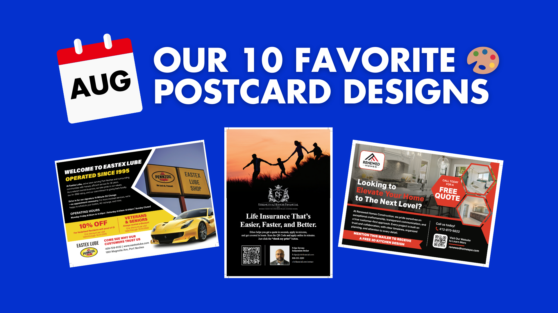
Our 10 Favorite Postcard Designs from August
August brought us another round of standout postcard designs that prove how creative, bold, and effective direct mail can be when it’s done right. All of these designs were created by Taradel’s in-house professional design team.
This month’s selection includes everything from HVAC and auto shops to restaurants, churches, home renovation, and even life insurance. Each of these postcards shines with strong design choices and calls-to-action that drive results.
Here are our top 10 favorite designs from August:
1. Green City Heating & Air Conditioning


Why We Love It: This design perfectly balances seasonal messaging with clear offers. The front grabs attention with a bold headline—“Stay warm in the winter and cool in the summer”—and the offer of a new gas furnace installation for just $3,999. On the back, the secondary promotion for a $129 furnace maintenance package ensures relevance for both new and existing customers.
Design Highlights:
-
Bold seasonal headlines
-
Two-tiered offers to appeal to different audiences
-
Professional imagery of technicians in action
-
Clear QR code, website, and phone number for easy response
2. Eastex Lube


Why We Love It: This postcard proves that straightforward pricing and local credibility go a long way. The oil change pricing chart on the front is big, bold, and impossible to miss. On the back, the “Operated Since 1995” headline builds trust while the 10% off coupons create urgency.
Design Highlights:
-
Eye-catching oil pouring visual on the front
-
Big, bold service pricing (Conventional, Synthetic, Diesel)
-
Veteran-owned business credibility statement
-
Multiple discounts (Nederland residents, veterans, and seniors)
3. Sakura Sushi & Grill Buffet


Why We Love It: Talk about appetizing! This design is filled with colorful food photography that makes the offer irresistible. The grand opening announcement paired with strong visuals ensures immediate attention. On the back, three separate coupons—lunch, dinner, and free bubble tea—give customers multiple reasons to visit.
Design Highlights:
-
Grand opening headline with bold red typography
-
High-quality food photography showcasing fresh ingredients
-
Multiple coupon offers to drive foot traffic
-
Clear hours, address, and phone number
4. Chicora Sporting Goods


Why We Love It: This grand re-opening postcard is both bold and community-focused. The front uses a dramatic red-and-black color palette to highlight the event date, while the back promotes local radio involvement and a chamber of commerce ribbon cutting. Combined with in-store discounts, it creates urgency and excitement.
Design Highlights:
-
Bold “Grand Re-Opening” headline with event date
-
Multiple discount tiers (reload supplies, gun orders, big spend bonus)
-
Strong community connection with radio and chamber of commerce partnerships
-
Outdoor imagery aligned with the store’s hunting/outdoor focus
5. Dwelling Artistry Renovation & Construction


Why We Love It: This design is sleek, modern, and professional—perfectly matching the high-end tile renovation services being promoted. The before-and-after photography instantly conveys the transformation. The bold price point of $8,500 is clear, while the testimonials and service list build trust.
Design Highlights:
-
Bold, professional branding with strong typography
-
Before-and-after photos showcasing real transformations
-
Clear price point ($8,500+) to set expectations
-
QR code for fast engagement
6. Renewed Homes


Why We Love It: This postcard captures the dream-home appeal with bold black-and-red branding and beautiful kitchen and bathroom imagery. The “Free Quote” and “Free 3D Kitchen Design” offers provide compelling incentives to call right away.
Design Highlights:
-
Striking red and black color scheme for high contrast
-
Gorgeous home renovation photography
-
Multiple offers: Free Quote + Free 3D Design
-
Trust-building headline: “Your Dream Renovation Starts Here”
7. Infix Services LLC


Why We Love It: This HVAC postcard is bold and to the point. The front highlights their $85 service call with a strong family-focused image. The back builds trust with industrial product imagery and reinforces their expertise in water source heat pumps and rooftop units.
Design Highlights:
-
Big, bold offer ($85 service call)
-
Family-centered lifestyle imagery on the front
-
Strong credibility with equipment photos
-
List of specialties for easy scanning
8. Strength & Honor Financial


Why We Love It: Life insurance marketing can be tough, but this design nails it. The front features a powerful family image at sunset with a bold headline: “Life Insurance That’s Easier, Faster, and Better.” The back simplifies the process with a “1, 2, 3” step layout, making it approachable and easy to understand.
Design Highlights:
-
Emotional family imagery for trust and relatability
-
Simplified benefits (no exams, quick approval)
-
QR code for instant quotes
-
Professional branding with strong typography
9. Tellico Avenue Baptist Church


Why We Love It: This postcard is warm and welcoming, exactly what a church mailer should be. The front uses inclusive language like “Welcome for Everyone” while the back highlights service times and a heartfelt scripture. It’s community-driven, approachable, and inspiring.
Design Highlights:
-
Friendly, inviting photography
-
Bold “Worship With Us” headline
-
Service times and contact details clearly listed
-
Scripture verse adds emotional resonance
10. Strength Recovery Center


Why We Love It: This design is sleek, modern, and professional—perfect for a behavioral health and recovery facility. The front communicates clear program options (full day and half day) with benefit-driven copy. The back keeps it simple with strong branding and a “Get Help Today” call-to-action.
Design Highlights:
-
Modern teal and black branding
-
Clear differentiation of program options
-
Empathetic, supportive photography
-
Simple but powerful CTA: “Get Help Today”
Final Thoughts
From food and auto services to HVAC, churches, insurance, and home renovation, these postcards showcase just how versatile and powerful direct mail can be across industries. Each design balances attention-grabbing visuals with clear offers and easy-to-follow CTAs.
Whether it’s coupons, seasonal promotions, event announcements, or heartfelt invitations, August’s best postcard designs demonstrate why print remains one of the most effective marketing tools today.
Learn more about professional postcard designs here.

