Every Door Direct Mail (EDDM) is a transformative approach in local advertising, providing a seamless solution for advertisers to send out promotional materials, like postcards, to every home or business within a specific area, eliminating the need for individual addresses or the purchase of mailing lists.
EDDM truly is a game changer in the realm of direct mail marketing, offering a unique and accessible means for businesses of all sizes to efficiently and effectively target their desired audience.
However, the real power of EDDM lies in its design. The right design can capture attention, convey your message clearly, and leave a lasting impression. A poor design can do just the opposite.
But, what does the “right” design look like?
We’re here not just to tell you what a standout EDDM postcard looks like, but to show you!
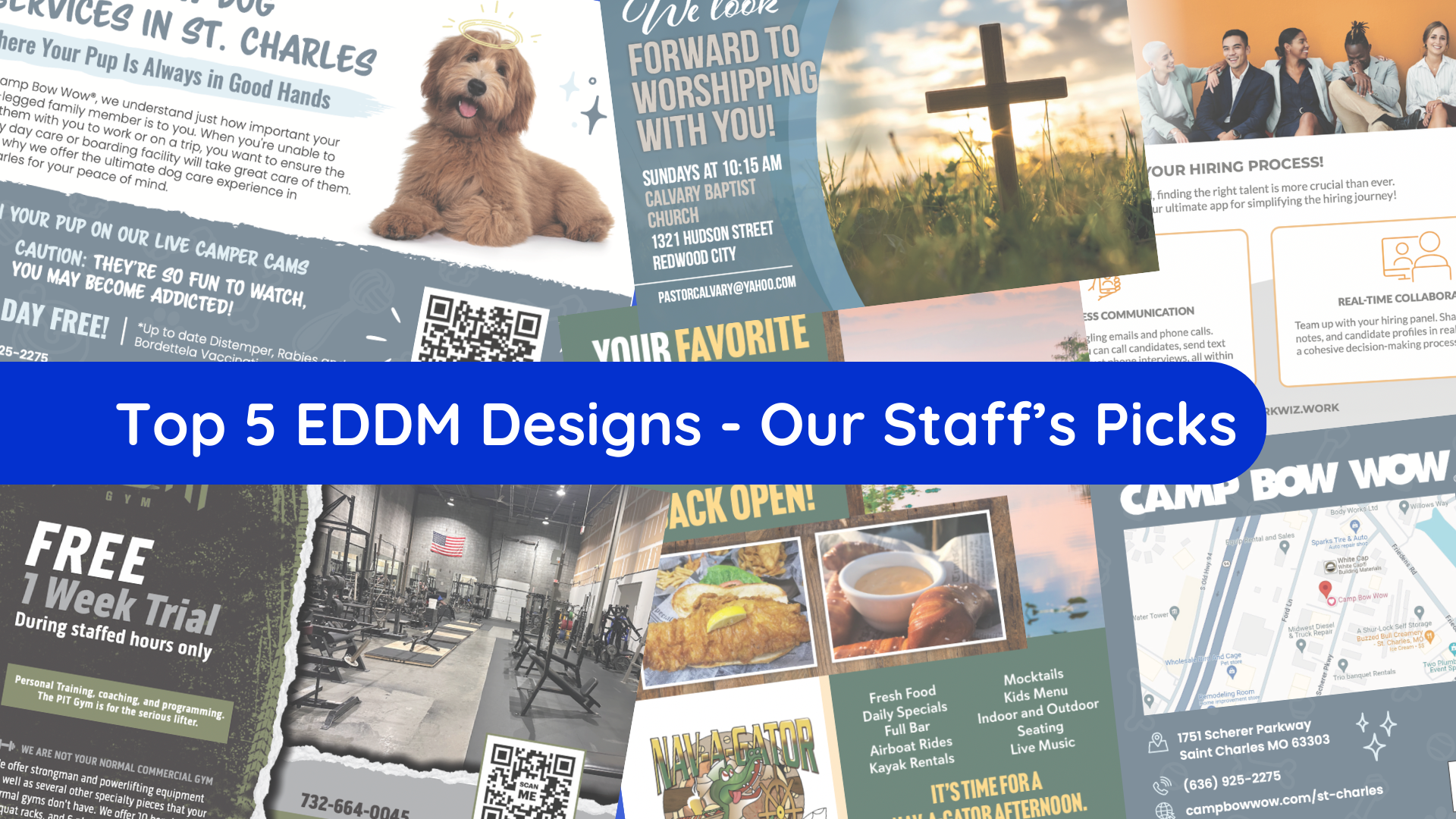
Below we dive into our staff's top picks for the 5 best EDDM designs. Our in-house, professional design team has created hundreds of thousands of standout EDDM campaigns. And today, we're here to show you the best of the best. From sleek and professional layouts to bold and innovative graphics, these designs are more than just visually appealing; they are proven performers that have delivered impressive results.
Note: All postcard designs below were created by Taradel’s in-house design team.
- A Pawsome Postcard – Camp Bow Wow


Visual Appeal:
The front of the postcard features a large, eye-catching image of a friendly dog that instantly resonates and connects with the target audience of pet owners.
Additionally, the color scheme is well-chosen, with a balance of neutral and vibrant tones that make the important areas of text stand out without overwhelming the eye. The same goes for the various and strategically employed font choices.
Clarity of Information:
This postcard, while featuring quite a lot of information, presents it in a clear and concise way. For example, the service being offered – show dog services in St. Charles – is placed as the headline on the front of the postcard in large, bold lettering, ensuring immediate understanding of the purpose of the mailer.
Keeping the information short and sweet on your mailers is critical as you must assume recipients are likely to give your postcard just a quick glance to determine its relevance before deciding if it earns a spot on their fridge as a future reference or ends up in the trash, forgotten.
Contact Information:
Like all postcards should, this postcard includes clear and easy-to-find contact information, with a phone number, website URL, and address prominently displayed on both sides of the mailers. This step is crucial because a consumer cannot transition into a customer without knowing how to initiate contact or locate your business.
While not always obligatory, this postcard offers an extra advantage by featuring a map snapshot. This addition is particularly beneficial for local residents, allowing them to precisely pinpoint your business location.
Tracking Mechanism:
Incorporating a tracking mechanism, such as a QR code, is a savvy strategy for measuring the campaign's response rate. Additionally, it offers a quick and interactive means for recipients to effortlessly access the "Camp Bow Wow" website or a dedicated promotion page.
Special Offer:
Including a special offer or coupon on your mailer is always a great idea. On this mailer, the offer of the "First Day Free" is a great incentive for new customers to try the service. It’s a low-risk proposition that can lead to higher conversion rates.
The additional information that up-to-date vaccinations are required acts as a pre-qualifier, ensuring that only serious and responsible pet owners respond.
Design & Brand Consistency:
It's essential to ensure that the postcard's design is not only cohesive across the mailer, but also aligns with your business's branding. This way, when a potential customer visits your website or social media profiles, they can establish an immediate connection between your advertisement and other platforms. Maintaining brand consistency plays a pivotal role in fostering brand recognition.
Camp Bow Wow's postcard seamlessly complements their other online platforms by incorporating consistent elements such as color schemes, imagery, and fonts.
2) A ‘Hire’ Quality Design – WorkWiz


Visual Appeal and Branding:
The incorporation of professional and diverse images of real people on the front side of the mailer is a testament to the company's approachable and person-centered ethos. This choice not only mirrors the company's commitment to assisting people but also has a high potential for creating a connection with a wide-ranging audience.
Moreover, the consistent color palette employed throughout the mailer aligns seamlessly with the brand's overall identity. This consistency reinforces brand recognition. When a recipient see’s another ad from WorkWiz or visits their website, they are more likely to instantly recognize the brand due to this visual consistency.
Content Clarity and Information Hierarchy:
WorkWiz's postcard skillfully addresses hiring challenges with a clear, strategic approach. The engaging headline, "Let's Revolutionize Your Hiring Process!", sets an impactful tone, while key phrases like "Effortless Communication" and "Real-Time Collaboration" succinctly target the audience's pain points.
This content is organized for easy readability, with bullet points outlining WorkWiz's benefits and features in an easily digestible format. This efficient presentation of information ensures potential clients quickly understand and appreciate the service's value, directly highlighting its transformative potential for their hiring processes.
Contact Information:
The URL web address is prominently featured on both sides of the postcard, ensuring that it is a main element the viewer's eye is drawn to, encouraging them to learn more online.
Tracking Mechanism:
The QR code prominently placed on the back side of the card is a great addition for tracking the campaign’s effectiveness. It also simplifies the process for recipients to download the app or visit the website, effectively bridging the gap between physical and digital interaction.
Strong Call-to-Action (CTA):
A strong CTA is the most important element of any marketing campaign as it directs and encourages recipients on what step to take next. The phrases "Join the community of forward-thinking companies" and "Download WorkWiz today!" serve as strong CTAs, motivating the recipient to take immediate action.
The CTAs are also complemented by directional cues, such as the smartphone graphic pointing towards the QR code, subtly guiding the recipient's eye and actions.
Value Proposition:
The postcard effectively addresses common challenges in the hiring process by succinctly highlighting key selling points with phrases such as "Effortless Communication" and "Real-Time Collaboration." This concise messaging not only resonates with the target audience by directly targeting their pain points but also suggests practical solutions in a relatable manner.
This strategic communication approach ensures that the essential benefits of the service are immediately clear, making it easier for potential clients to see the value in what WorkWiz offers.
3) Back & Ready to Atack! - Nav-A-Gator Bar & Grill


Visual Appeal:
The postcard features vibrant and appealing graphics, such as images of the restaurant's offerings and the scenic riverfront location, which can attract the recipient's interest immediately.
This use of actual photos of the food and environment gives potential customers a realistic preview of the experience, building anticipation and desire.
Clear Contact Information:
The phone number and address are prominently displayed, making it easy for recipients to know how to reach or visit the restaurant.
The website URL is also provided, giving recipients a straightforward way to find more information or engage with the restaurant online.
Excitement & Urgency:
The postcard generates a compelling sense of excitement and urgency with headlines like "YOUR FAVORITE RIVERFRONT RESTAURANT IS BACK OPEN!" and "IT’S TIME FOR A NAV-A-GATOR AFTERNOON." These phrases not only capture attention but also evoke a sense of immediacy and enthusiasm.
Together, these messages effectively stir a sense of eagerness and urgency, encouraging prompt action and re-engagement with the restaurant in a lively and inviting manner.
Special Offer:
The postcard provides compelling special offers, like "$5 OFF $50 or More!" and "$10 OFF $100 or more!" These offers are likely to encourage recipients to visit the restaurant, especially if they are further enticed by the delicious images and descriptions.
Brand Consistency and Engaging Copy:
The postcard skillfully combines consistent design with captivating copy to enhance brand recognition. Featuring the restaurant's distinctive logo, colors, and "gator" and waterfront themes, the design immediately resonates with the brand's identity.
Complementary to this, phrases like "The Road Ends Where The Adventure Begins..." and "Fresh Food, Daily Specials, Full Bar" succinctly convey the unique dining experience offered, appealing to the target audience. This strategic blend of familiar visual elements and engaging copy not only reinforces the brand but also creates a memorable and distinctive impression for customers.
4) A Community Centric Card - Calvary Baptist Church


Visual Appeal:
The postcard features tranquil and inspiring imagery of a cross, designed to deeply connect with its intended audience while also extending a warm and inclusive welcome to newcomers within the church community. The use of high-quality, expertly captured images further elevates the overall aesthetic of the postcard.
Contact Information:
The service times, church address, and pastor's contact email are clearly listed, making it easy for recipients to know when and where to attend, and how to get in touch for more information.
Encouraging Call-to-Action (CTA):
The CTA "We look forward to worshiping with you!" along with the added detail of "Some folks still prefer the music they grew up with - Classic Hymns!" are clear and effectively communicate the invitation and the church’s unique offering.
Highlights “Special Offer”:
There isn't a special offer in the traditional sense, such as a discount or gift, but the invitation to worship and the opportunity for hymn-loving piano players to share their talent are presented as valuable experiences in themselves.
This offer is about creating value through participation and connection, celebrating the beauty of traditional hymns, and inviting individuals to be an active part of a community that values and nurtures their musical gifts.
Design and Messaging Consistency:
The design and messaging of this postcard are harmoniously aligned, emphasizing the church's warm and inviting atmosphere alongside its traditional musical worship style. This thoughtful consistency is likely to resonate with individuals seeking a church that offers a classic, community-focused worship experience. The design elements skillfully complement the message, creating a cohesive and appealing representation of the church's identity and values.
5) A Very 'Fitting' Design - The Pit Gym


Visually Appealing Graphics:
The postcard features high-contrast, gritty visuals that align with the gym's branding as a place for dedicated, hardcore lifters. This is emphasized by images of the gym's interior, showcasing the equipment and space.
The torn-edge graphic effect adds to the 'raw' and 'tough' aesthetic that is likely appealing to the target demographic interested in strength training and powerlifting.
Contact Information:
Essential contact details like the phone number, website, and physical address are prominently displayed, making it easy for potential customers to learn more or take action.
Tracking Mechanism:
A QR code is smartly incorporated, which can track the success of the mailer campaign and also provide an easy way for potential customers to learn more about the gym or sign up for the trial.
The placement of the QR code is consistent on both sides, ensuring visibility regardless of how the postcard is displayed.
Special Offer:
The special offer of a "FREE 1 Week Trial" is a strong CTA that is likely to motivate potential customers to visit the gym. This type of offer can be especially effective in the fitness industry where customers appreciate the chance to try before committing to a membership.
Design Consistency:
There's a strong design consistency between the two sides of the postcard, with both sides featuring the same color scheme, fonts, and graphic elements, reinforcing the gym's brand identity.
Additionally, the postcard's design aligns seamlessly with the brand's aesthetic across their website, social media platforms, and the physical gym space.