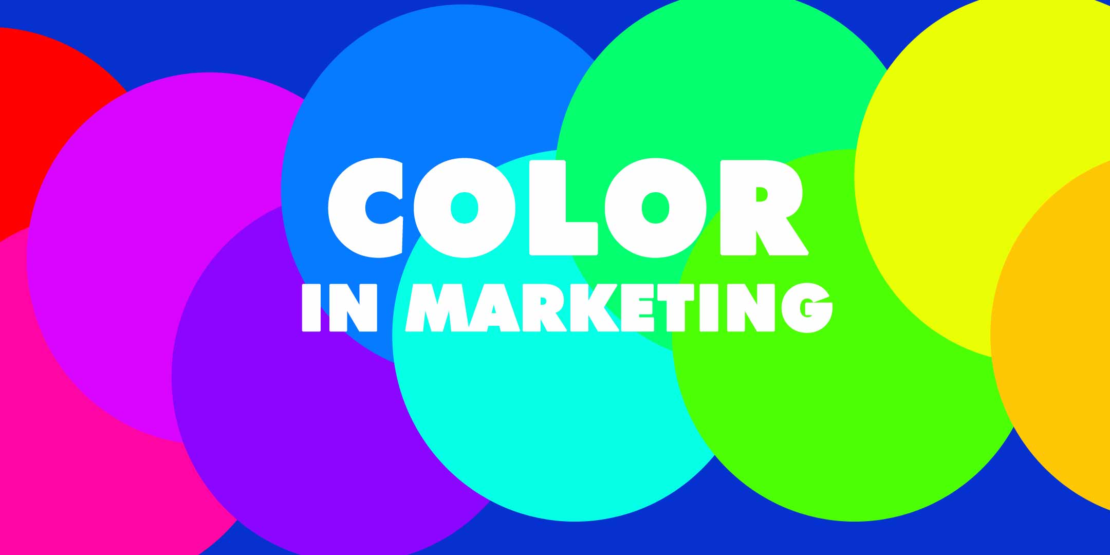
The Science of Color in Every Door Direct Mail Marketing | Taradel
Published by
Staff
on
Arguably the most important element of your Every Door Direct Mail campaign is the actual mailer you are distributing. Or rather, your extremely well-written and carefully composed mailer with clever hooks, angles, twists and turns, all rounded off with a nice robust CTA designed to entice and convert.
However, there is an element that often gets overlooked: the basic and almost elementary element of color.
Oftentimes (but certainly not all the time) advertisers and marketers focus so intently on the actual written copy and/or layout of the literature, that they sometimes neglect the proper use of color. They do so at their peril, because regardless of how great the actual written copy is, color speaks a language that words alone cannot compete with. Color is a subliminal, psychological language that will contribute immensely to the success of your literature.
Deploy color correctly, and you are giving an extra boost to your campaign that could make the difference between mediocrity and major success.
Color Your Way to Success
The way our brains perceive colors plays a crucial role in ensuring our marketing materials resonate with their intended audiences. And when you scratch beneath the surface of any marketing campaign, that is all we are trying to do here - resonate, and convert. It's all about that resonation, and while our written copy resonates in a literal sense, color does so in a more subliminal way.
When you take a closer look at the colors commonly used in advertisements for your industry, you'll start to notice certain hues appearing over and over, again and again. It is an odd thing that you only notice when you start to look for it, but as soon as you see it, you can't stop unseeing it.
These are not just your competitors' favorite colors, of course. Research shows that these are the colors that your audience associates with their needs and expectations from brands like yours. Advertisers use certain colors to evoke specific emotions - or at least, that is the intention.
By picking the perfect color palette for your marketing campaign, you are essentially utilizing a blend of aesthetics, testing, and possibly even hard science. In fact, the science of color marketing is more important than you might think. In this article, we'll delve into the fascinating world of color psychology and explain how you can use it to create more effective marketing messages.
Color Guide For Direct Mail Marketing
So, for effective direct mail marketing that resonates and inspires, you need the right ingredients of a pleasing design, engaging copy, and colors that coincide with your brand.
Colors not only enhance the look but also evoke emotions, making it crucial for the response you are aiming for. To obtain the correct response, it's crucial to understand the emotions each color evokes.
Here, we'll go color by color to break down when you should use each one to achieve your promoting and marketing objectives.
Blue
Usually thought of as a masculine color, blue has many other relatable connotations that make it a versatile and very common color in marketing. Some of the key associations linked to blue include:
- Calmness
- Tranquility
- Refreshment
- Stability
- Responsibility
- Peace
- Relaxation
- Sadness
It's no surprise that banks will commonly use blue as it conveys a sense of authority and stability, creating a trustworthy and dependable image. On the other hand, a yoga studio may use blue in its marketing materials to emphasize the atmosphere of calm and tranquility that visitors can experience. Similarly, a brand that sells safety gear such as helmets and goggles can also use blue to communicate a message of protection and trustworthiness.
Green
Known as a soothing color that is frequently used to imply nature, maturity, competence, and serenity. Believe it or not, green has even been demonstrated to have a calming impact on consumers by reducing their heart rate and blood pressure. Some of the connections frequently made with the color green are:
- Finances
- Environment
- Health
- Achievement
- Growth
- Wealth
- Harmony
- Balance
- Soothing
- Renewal
Green is a color that works especially well for health food brands as it has a natural, fresh, and almost quite vibrant feel. It is a great option for companies that are eco-friendly or use organic products because it additionally reminds people of the recycling logo.
Green is also the ideal hue for spas to emphasize the relaxing and rejuvenating experience that guests can look forward to - if you think about it, every single spa logo you have ever seen probably contained green, on some level?
Red
Red is a striking color that commands attention and is frequently linked to:
- Love
- Verve
- affection
- Warmth
- Fire
- Combat
- Anger
- Danger
- Self-assurance
To use a direct example, a dating service might use red to convey a feeling of sexiness and excitement that is only for the ‘adventurous’. Red is also a great color for food establishment signage because it can raise viewers' blood pressure and metabolism (again, believe it or not!), luring them inside for a spicy meal.
Pink
Pink is a color with strong associations related to femininity. Pink is generally a common choice for marketers and advertisers seeking to evoke a specific mood or feeling pertaining to all things feminine, even though it can occasionally turn men away. The following are some relationships with the color pink:
- Fun
- Girly
- Upbeat
- Sweet
- Delicate
- Romantic
- Peaceful
To give another specific example, pink is also a color that is frequently used by bakeries in branding and marketing materials because it highlights how scrumptious and delicious the cakes and breads they provide are.
Yellow
Customers usually equate yellow with affordability and hope. It benefits (rather uniquely) from being both fanciful and bold at the same time. Further associations with yellow include:
- Energy
- Happiness
- Danger
- Youth
- Playfulness
- Cheerfulness
- Warmth
In corporate branding, yellow is frequently linked to joy, vigor, youth, and attention-grabbing attributes. It is not, however, utilized as frequently as other primary hues. Coca-Cola, CNN, Adobe, or Target might come to mind when considering well-known logos that prominently incorporate the color yellow in their designs.
Purple
With connections that range from royalty and elegance to spirituality and imagination, purple exudes a feeling of intrigue and sensuality. The following are some popular associations with the color purple:
- Royalty
- Luxury
- Intrigue
- Magic
- Mystery
- Defense honor
- Wealth
- Imagination
- Spirituality
Purple might express a sense of richness and luxury. Consider for example a financial planning firm that specializes in serving soldiers and their families. The usage of purple can give marketing initiatives across a variety of industries a dash of mystery and refinement.
Orange
Orange is a bright, happy color that resembles its near cousin, red, in terms of warmth and high vitality. The following are some more connotations with the color orange:
- Youth
- Affordability
- Vitality
- Friendliness
- Humor
Orange is frequently used in marketing to represent youth, liveliness, and being assertive. Orange is also frequently associated with health, vigor, and attention.
Black
Although black is literally the absence of color, it has a strong presence that is difficult to ignore. Black is frequently associated with the following things:
- Luxury
- Mystique
- Power
- Formality
- Elegance
- Darkness
- Mystery
- Sexuality
- Control
- Unseen forces
Black may be employed to convey a sense of creepiness or unease as well as being perceived as sophisticated and modern, making it ideal for businesses that specialize in mystical products. Black also exudes a strong feeling of authority, making it a fantastic choice for gyms, for example, that encourage their members to be "their strongest selves". Ultimately, black is a flexible color that can be utilized in marketing materials to evoke a variety of feelings and moods.
White
White acts as a blank canvas for artistic expression since it conjures up feelings of newness and freshness. The following are some frequent associations with the color white:
- Sanitation
- Pureness
- Blankness
- Simplicity
- Youth
- Pride
- Tranquility & peace Coolness
White's coldness and sterility may be negatively stereotyped by some, however these qualities can be employed to convey a smart marketing message. For instance, a truck selling ice cream might stress the coolness and relief that their products provide on a hot day by using white in their logo.
Final Thoughts
Colors play a crucial role in your direct mail campaign. By deploying the correct color that matches your brand, message, or product, you stand a much better chance of hitting the right marketing notes through subliminal messaging.
You might want to think about playing around with different color options and A/B testing your Every Door Direct Mail Campaign. Along with your established brand colors, additional color hues will serve to inject more specific and targeted emotions from your prospects.
We happen to know a thing or two about designing marketing mail letters and postcards that hit those right marketing notes. If you need help in designing your perfect direct mail letter please do get in touch. Our design experts are here to help and with a little professional analysis, we can produce literature that not only reads great, but also employs color in a way that will ensure your message positively bursts off the page and crushes your ROI!