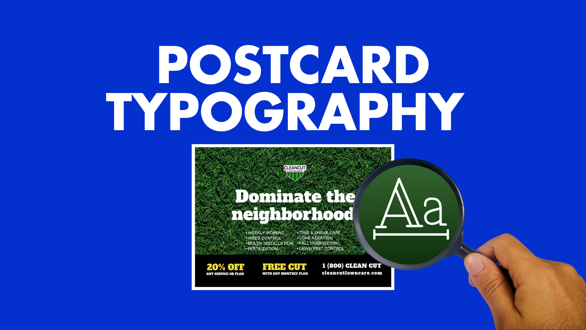
Typography Tips for Postcards That Actually Get Read
Published by
Staff
on
Typography determines whether your postcard gets read or ignored. Clear, well-structured type helps readers instantly understand your message, notice your offer, and take action. When typography is hard to read or poorly organized, even the most compelling offer gets lost.
Here's something you may not know: using the right font can lower printing costs by up to 77% (Toner Buzz). That's not just design efficiency; it's budget strategy.
In this guide, we cover postcard design best practices, how to create effective postcard layouts, and ways to use clean fonts and engaging headlines to create a strong visual order.
Why Is Typography Important in Advertising?
Typography is the silent persuader, influencing action without saying a word. When headlines, subheads, and body text are clear, organized, and visually balanced, your message lands instantly.
What Makes a Good Postcard?
A good postcard gets read and acted upon. Here's what separates successful designs from forgettable ones:
Clear Headline
Your headline should be short, bold, and benefit-driven. Use typography to make it pop, like:
- A larger font size
- Contrasting color
- Strategic placement
Readable Fonts
Avoid overly decorative typefaces. Stick to clean sans-serif or serif fonts with good spacing.
Organize your content so the reader knows where to look first. Use font size, weight, and color to create a logical flow.
Whitespace
Don't cram your postcard with text. Whitespace improves readability and draws attention to key elements.
Call to Action
Make it easy for the reader to take the next step. Use bold typography to highlight your CTA (call to action), whether it's "Call Now," "Visit Us," or "Get 20% Off."
Postcard design best practices revolve around:
- Clarity
- Simplicity
- Strategic emphasis
Typography is the tool that brings all three together.
Typography Tips for Engagement
Here's how to use typography to elevate your postcard design. Try these tips.
Choose Fonts That Match Your Message
Your font should reflect your brand and the tone of your message. A tech company might use a modern sans-serif like Helvetica. A boutique might lean into a serif like Georgia. Match font personality to your purpose.
Avoid styles such as Comic Sans, Papyrus, or any font that distracts from your message.
Prioritize Readability Over Style
Fancy fonts might look cool, but if they're hard to read, they fail. Stick to readable fonts for postcards, those with:
- Clear letterforms
- Good spacing
- High contrast against the background
Test your font at actual postcard size. What looks fine on screen might be illegible in print.
Use Font Size Strategically
Your headline should be the largest text on the card, ideally 18-24 pt. Subheads can be 14 to 18 pt, and body text should be no smaller than 10 to 12 pt. This creates a clear postcard visual hierarchy.
Limit Font Styles
Stick to two fonts max, one for headlines, one for body text. Mixing too many fonts creates visual clutter and confuses the reader.
Use bold or italic styles within the same font family to add emphasis without losing cohesion.
Align Text for Easy Scanning
Left-aligned text is easiest to read. Centered text can work for headlines, but avoid it for body copy. Consistent alignment improves flow and comprehension.
Limit Lines and Word Count per Line
Humans read in short bursts, so keep lines to six to eight words or fewer when possible. Avoid long, justified blocks; use short bullet points if needed.
Use Color to Highlight, Not Overwhelm
Make sure your text contrasts with the background. Use bold colors for headlines and CTAs, but keep body text neutral for easy reading.
Avoid light text on light backgrounds, neon colors that strain the eyes, or placing text over busy images unless you add a subtle overlay.
Don't Forget Line Spacing
Keep line height and margins consistent. Tight spacing makes text feel cramped, and too much space makes it feel disconnected.
Aim for 120 to 140 percent of your font size. For example, 12 pt text works well with 14 to 16 pt line spacing.
Use Violators and Directional Cues Strategically
Arrows, banners, and boxes, called violators, draw attention to key offers or CTAs when used sparingly. Directional cues, such as lines, shapes, or pointers, guide the eye from the headline to the CTA or indicate where to flip the postcard.
Test for Glanceability
Postcards are usually glanced at, so your text must communicate instantly. Ask yourself: "Can I read the headline right away? Does my eye know where to go next?"
Slightly larger fonts and open spacing improve readability. All caps can make short headlines stand out, but avoid using them for longer text.
Adjust for Printing Limitations
Embed fonts or convert them to outlines to ensure they print correctly. Keep text away from edges to avoid being cut off by minor printing shifts.
Frequently Asked Questions
What Are the Most Readable Fonts for Postcards?
Fonts like Helvetica, Arial, Georgia, and Open Sans are widely considered readable. They have clean lines, good spacing, and high legibility in print formats.
Display and script fonts are best used for very short, attention-grabbing bits (like a greeting word).
Can I Use Humor or Storytelling in a Postcard?
Absolutely. Humor, emotion, or a short narrative can make your postcard memorable. Just keep it concise; postcards are scanned quickly, so every word and image must serve a purpose.
Should I Use Both Sides of the Postcard?
Yes. Use the front for visual impact and the back for details and your call to action. Make sure the back is still visually engaging and easy to read, especially around the address and postage areas.
Should I Hire a Designer or Use a Template?
Both have their advantages. Hire a designer when you want a unique postcard that fully reflects your brand and maximizes engagement. Use a template when you need a proven layout quickly, want to save time, or are running multiple campaigns with consistent branding.
Typography Is What Makes Your Postcard Work
Typography is the backbone of good postcard design. With deliberate choices in type, structure, and emphasis, combined with engaging postcard headlines, you can deliver a message that lands fast and leaves an impression.
Make every postcard count with Taradel, where marketing expertise meets smart, eye-catching design. Our all-in-one platform simplifies your campaign, turning complex strategies into clear, actionable results. Let us help you connect with your next customers and elevate your brand.
Tags:
typography,
postcard design best practices,
effective postcard layouts,
postcard visual hierarchy,
readable fonts for postcards,
engaging postcard headlines