Minimalist vs. Bold: Which Postcard Design Drives More Action?
Published by
Staff
on
The right postcard design can instantly boost your campaign's response, but knowing whether to go minimalist or bold is what separates postcards that get noticed from those that get tossed. A well-chosen style stands out, builds interest, and turns viewers into customers.
Postcards have a unique advantage: they keep working long after you send them. In fact, research shows that the average household holds onto mail for 17 days, giving your postcard repeated chances to make an impression (Zipdo). If your business hasn't yet tapped into this marketing potential, keep reading to discover the principles behind creating postcards that truly make an impact.
This article breaks down the strengths of each approach, shares postcard design inspiration, and helps you choose a visual strategy that drives real results.
What Is Postcard Marketing?
It is a direct mail strategy that uses printed postcards to promote a product, service, event, or brand. It's cost-effective, tangible, and surprisingly powerful in a digital-first world. Why it works:
- High visibility: Unlike emails, postcards don't need to be opened.
- Targeted reach: You can send them to specific demographics or geographic areas.
- Low cost, high impact: Printing and mailing are affordable, especially in bulk.
Whether you're a local business, real estate agent, or e-commerce brand, postcard marketing offers a personal touch that digital ads often lack.
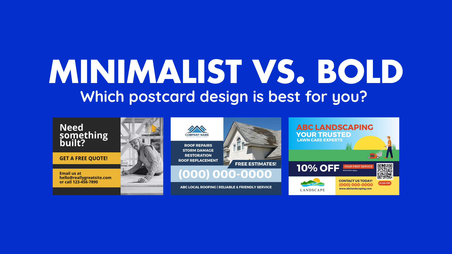
Minimalist vs. Bold: A Design Showdown
Every design decision shapes how your message is received. Take a look at this breakdown:
Minimalist Design
Minimalist postcard design emphasizes simplicity. Think generous white space, restrained color palettes, clean typography, and one clear focal point. Here's why it works:
- It reduces distractions so the reader can focus on your message
- It feels elegant and upscale
- It may appeal to audiences who favor sophistication or subtlety
Risks or limitations to consider:
- If you strip out too much, you risk under-communicating
- It may be too subtle to stand out among colorful mailpieces
- It depends heavily on strong messaging and typography
Bold Design
Bold designs feature vibrant colors, dramatic typography, and eye-catching graphics. Strengths of this approach include:
- It grabs attention instantly
- It creates emotional urgency or excitement
- It fits nicely for flash promotions or energetic brands
Keep the following in mind:
- It may look noisy or aggressive if overdone
- If the messaging doesn't match the boldness, it might appear gimmicky
- It can overwhelm delicate or understated brands
Which Style Drives More Action?
The more effective style depends on your audience, offer, brand identity, and campaign objective. Here's how to reason it out:
Match Design to Your Audience & Brand
Minimalist designs suit upscale audiences and professional services, or anyone who prefers clean, sophisticated visuals. Bold designs are practical for time-sensitive promotions, such as flash sales, grand openings, or special events, because they catch the eye quickly.
Experiment with creative postcard ideas and visual postcard strategies to set your campaign apart. This could include adding bold accent colors to a minimalist layout, using high-quality imagery, or incorporating playful graphics.
The goal is always to balance eye-catching visuals with a clear message and a strong call to action.
Let Your Offer Guide the Design
A subtle brand update or announcement might not need bold visuals; minimalism could suffice. But for a "50% off this weekend only" offer, a bold design can amplify the call to act.
Use Contrast, Not Extremes
You don't have to commit wholly to one style. A minimalist layout can include a bold accent color or hero image to drive focus. A bold design can incorporate whitespace to breathe.
The trick is balancing attention and clarity.
Use Design Best Practices
Regardless of style, certain approaches improve results. Consider these effective postcard design suggestions:
- Use a clear, benefit-focused headline
- Keep copy concise
- Highlight one strong call to action
- Use readable typography and good contrast
- Include your branding (logo, contact)
- Use high-resolution graphics and respect print safe zones (areas where important content won't be trimmed during printing)
- Provide tracking (coupon codes, QR codes, unique URLs) so you can measure response
Test With Small Splits
Run A/B tests, sending minimalist and bold postcards to sample segments. Measure response rates. Over time, you'll get to know which design works better for your market.
Frequently Asked Questions
Why Do Postcards Still Work In a Digital Age?
People receive hundreds of emails daily, but physical mail feels more personal and tangible. A postcard cuts through digital noise and stays visible on a recipient's desk or fridge.
How Many Mailings Does It Take to Get Results?
Don't expect instant success. Most recipients won't act on a single touchpoint, but repeated exposure builds familiarity and trust. That's why most campaigns mail postcards to the same audience 3-5 times, spaced strategically over several weeks.
This repetition helps your message resonate and feel more credible, leading to better results.
What Are the Best Colors for Postcard Marketing?
Bright colors like orange, red, and yellow prompt action. Neutral tones like white, gray, and navy provide versatility and can support other elements. Use contrasting text and background colors to make your content easy to read.
Should I Include Images, or Stick to Graphics?
It depends on your message. High-quality photographs work well to evoke emotion or show a tangible product. Graphics or icons can simplify complex ideas or create eye-catching visuals.
Often, a blend of both (or a bold graphic element within a minimalist layout) works best.
What Are Common Postcard Design Mistakes?
Avoid design mistakes that can hurt response rates or brand perception. This includes:
- Cluttered layout
- Tiny or unreadable text
- Ignoring the back side
- Poor image quality
- No brand consistency
- Overdesigning for small formats
Postcard Design That Converts
There's no one-size-fits-all answer. Match your postcard design style to your audience and campaign: use bold colors for time-sensitive offers, and minimalist styles for premium services. If you're unsure, test both; postcard marketing thrives on experimentation and refinement.
At Taradel, we connect your business with the right customers and turn every campaign into measurable results. By combining your unique selling points with our proven strategies, our marketing experts transform your postcards and brand into a true powerhouse. Visit our website today and turn your ideas into real-world wins.
Tags:
postcard marketing,
Postcard design,
effective postcard design,
creative postcard ideas,
postcard design inspiration,
visual postcard strategies